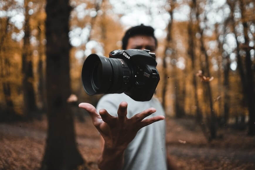
Light and dark contrast in photography is one of the most important components that can not be ignored in a frame. There are various ways to improve photo views by enhancing or reducing the contrast. When you know how to manipulate contrast in photography, it can change the look of a picture.
The photography contrast forms are named differently and can make or break a photo’s look. This article will discuss the significance of contrast in photos and with light and dark contrast themes. No doubt, light and dark contrast play an excellent role in improving both the visual and conceptual aspects of photography.
So, here we will explore more about it in detail. So, let’s dive in!
Definition of Contrast in Photography
Suppose you want to know the definition of contrast in photography; you have to understand that there is a difference in tone or color between different things located close to each other and visible in photographs. The light intensity and quality always affect the contrast level in a photograph. The colors and tones of different elements in your photographs also play a huge role in creating the overall contrast. You can have a high-contrast or low-contrast image depending on different factors easily.
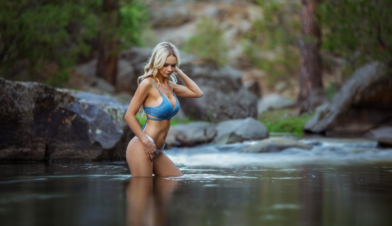
Contrast denotes the range of brightness that varies from the lightest to the darkest forms visible in an image. A high-contrast image consists of bright highlights and very dark shadows. Sometimes, pure white or the shadows of pure black are the highlights of a photo, denoting the high contrast. However, good contrast in photographs is subjective.
Contrasting the Details of Colors and Tones in Photography
Contrasting colors and tones in photography matter a lot. However, when you check the examples of framing in photography, you can get a clear idea of the contrast. It is not always about monotone shades of light. Contrasting colors and tones under any lighting condition can take your photos to the next level. The zone system and color theory are wholly different subjects that let photographers know how to use complementary colors and create stunning photos.
Any lighting condition, tones, and colors can create unique and different contrast levels. Sometimes, a particular color is distracting and might ruin the whole image. Color contrast can change a colored image into black and white.
There are many cases when, even under the softest light, you can create significant contrast using dark-toned and light-colored things. But remember, this can work in your favor or against you.
Different Types of Contrast in Photography
Having in-depth knowledge and understanding of each type of contrast in photography can make you a master here. Knowing this will help you be selective with the right contrast styles and know the best times to use them.
Let’s look at some examples where contrasts play a crucial role.
1. Tonal Contrast
It’s used in the first photographs to help build an image. Most modern cameras rely on this style to power the autofocus algorithms of the camera processor.
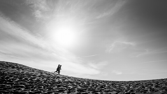
2. High Contrast
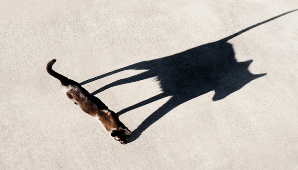
Higher contrast images always show a significant difference between brighter and darker elements. The high contrast photography is excellent for making a strong point and shows a higher intensity level to create something vivid and bold.
3. Low Contrast
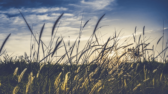
Low-contrast images are softer and flatten the saturation of different intense colors. Sometimes low-contrast photography is best when you want to create a calm and gentle photo with a subtle representation.
4. Color Contrast
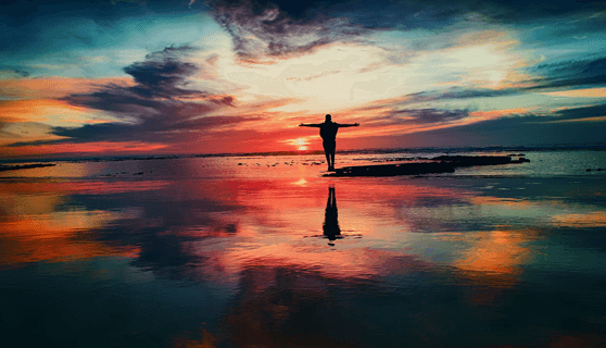
Color contrast is a great way to develop a story and catch the viewer’s eye. The clarity and intensity in such photos are far greater compared to others. Color contrast can usually be either intense or mellow.
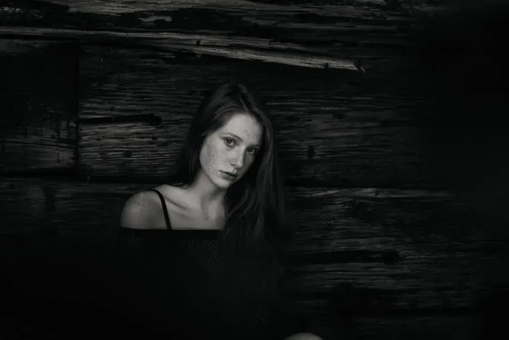
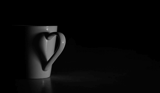
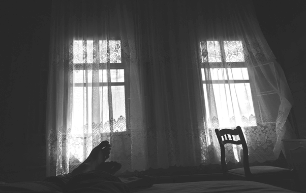
5. High-Key and Low-Key Contrast

You have probably heard about high-key and low-key contrast in photography circles. A high-key image composed of bright tonal values at the lighter end of the scale. At the same time, the low-key images create contrast primarily through lower or darker tones without the need for brighter tones.
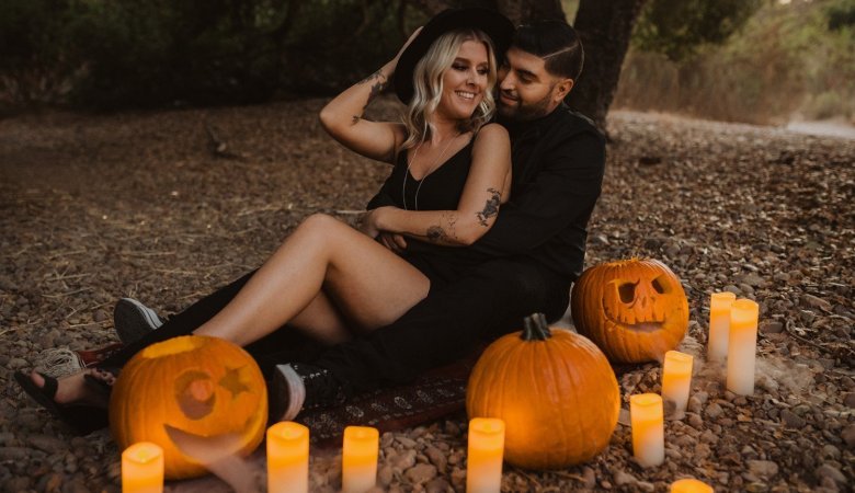
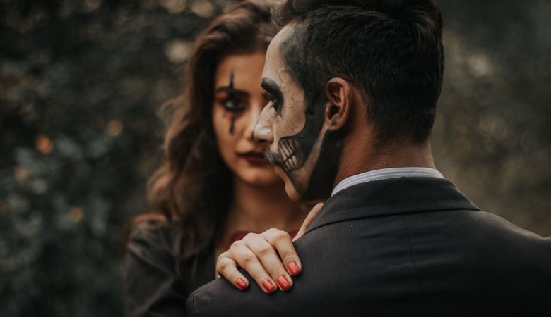
6. Conceptual Contrast
Conceptual contrast is an innovative technique that conveys an excellent narrative to create an advanced composition. The conceptual contrast gives the viewer a clear sense of concept and even emotion through the image.
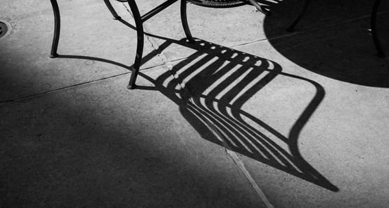
7. Contrast Through Textures
Textural contrast has a strong connection to conceptual contrast. The different appearance of varying textures usually creates a natural contrast. Combining soft elements with rough ones can give an extra punch here.
More or Less Contrast – What Do You Need?
Photographers must understand the dark and light color contrasts and tones related to camera control. If you love to click photographs, learn how to contrast properly. Whether you want to create high-contrast photos or low-contrast photos, you are the one who can control these things.
If you want to differentiate between different middle tones, a dark background, and pure white elements can assist you in working on your photos effectively. Check the contrast levels when you compose your photos. Take your time and decide between low-key or high-contrast photos that you want to create. However, once you learn to manage the contrasts in your photos, rest assured that they will be visible in photographs.
Conclusion
All in all, the best thing you can do is check out some examples of framing in photography and get an idea of the contrast effects of each photo you capture and how a photo will grab the viewer’s attention.!
All photographers or people interested in photography must know that contrast is crucial for taking all kinds of shots. They help convey a mood or a message to the viewers by finding the right color combinations, contrasts, and conceptual contrasts.
Get an idea of different scenarios and achieve the result you want.
Leave a Reply